Using Charts
Click the "Chart" toolbar icon and select the chart type you would like to view.
Once selected, the chart will be saved and available when the report is opened.
- Show data for lowest level (hide parent data) - show chart data on the lowest level
- Switch chart axis - move rows to columns and columns to rows
- Height - chart height in pixels
- Width - chart width in pixels
- Chart position:
- Top
- Bottom
- Right
- Left
- No Table - hides data grid
- Margin - margin around the chart in pixels
- Color Palette - Chart Color Palette to be used
- Chart Ceilings - Y axis top. Two values are available when using a dual axis chart.
- Chart Floor - Y axis bottom. Two values are available when using a dual axis chart.
- Legend
- Show Legend - Shows / Hides chart legend
- Legend width - Legend width in pixels
- Legend Position - Right, Left or Bottom relative to the chart
- Flash
- Enable Flash Animation - show animation on chart load
- Show empty as zero - if unchecked bars or lines will be missing when the data is empty
- Round edges - round data bar edges
- Chart Color Palette - choose slightly different color scheme
- Background Color - set background color
- Hide Canvas - hide background box
- Force Decimals - will force decimals even if there are no decimals after the decimal point
- Labels - Show, None, Wrap, Stagger, Rotate, Slant
- Prefix - place prefix ($) or suffix (%) for the data values. Two values are available when using a dual axis chart.
- Separator - choose international number formatting. Two values are available when using a dual axis chart.
- Scale - choose data formatting scale (10K or 5M). Two values are available when using a dual axis chart.
- Decimals - number of digits after the decimal point. Two values are available when using a dual axis chart.
- Show Title - Show report title as chart title
- Show Values - show value for each bar
- Place Values Inside - place values inside of the data bars. Will be visible only if "Show Values" option is checked.
- Rotate Values - show values vertically. Will be visible only if "Show Values" option is checked.
- Lines - number of dividing lines
- Show Filters - show filter values in the report sub-title
- X Axis Label - show X Axis Label
- Y Axis Label - show Y Axis Label
If the drill down or expand mode is selected, the chart becomes interactive.
When a chart element (bar, slice or a line-chart node) is clicked,
the report will be expanded or filtered by the clicked element.
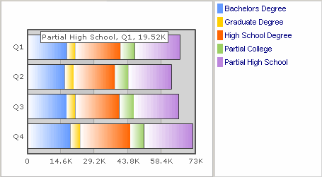
If you hold the mouse longer over the chart element the tool tip with numeric value and
description will be shown.
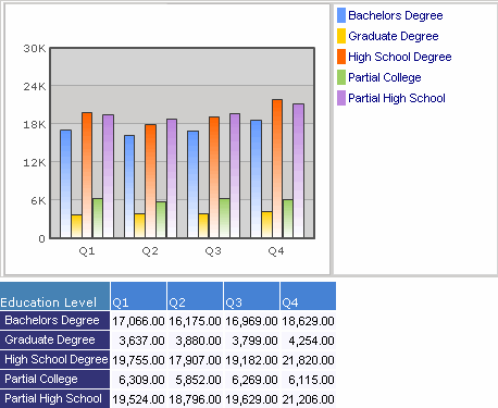
HTML Charts
HTML chart does not require any external components to be installed in the client browser.
For this chart type, when the mouse cursor moves over the chart the
legend will scroll to the selected member
and the cell in the result table will be highlighted.
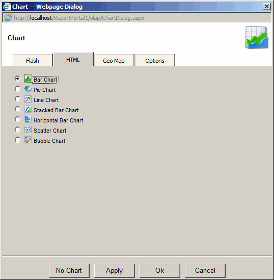
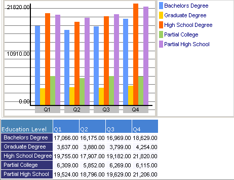
Bar Chart
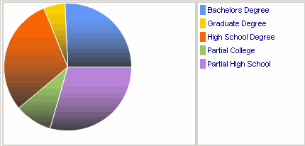
Pie Chart
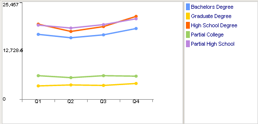
Line Chart
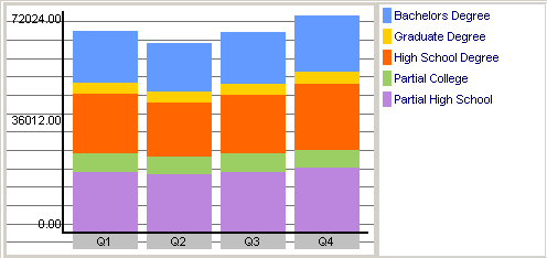
Stacked Bar Chart
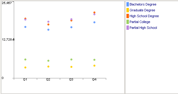
Scattered Chart
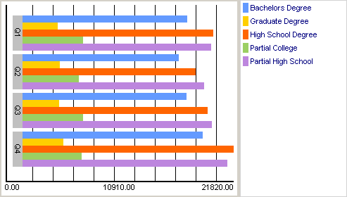
Horizontal Bar Chart
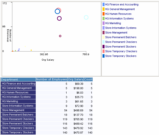
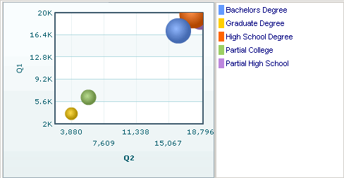
Bubble Chart
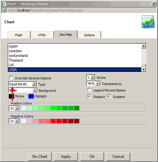
Geo Map Options:
- Override General Options - Overrides settings from the Map XML file stored in C:\inetpub\wwwroot\ReportPortal\olap\Maps
- Type
- Equal Bands - based on equally divided ranges. Example: $0-$100 and $100 to $200
- Percent of Max - based on percent of a maximum value. Example: 0%-20% and 20%-100%
- Percent - based on percent of a total. Example: 0%-20% and 20%-100%
- Value - based on absolute value. Example: $0-$100 and $100 to infinity
- Name - based on the measure text. Example: Mexico and USA
- Background - background image from image files located in C:\inetpub\wwwroot\ReportPortal\olap\Maps
- Stroke color - stroke color of each shape
- Highlight - color of each shape on mouse-over
- Blank color - color of empty shapes
- Stroke - stroke width in pixels
- Transparency - how transparent the chart is relative to the background
- Legend Percent Based - legend to be based on percent or absolute value
- Shadow - each shape to cast shadow
- Gradient - each shape to be fill with solid or gradient color
- Positive Colors - colors for shapes based set of positive values. The selections will be based on Type: number of colors, shades of colors and thresholds or value.
- Negative Colors - colors for shapes based set of negative values. The selections will be based on Type: number of colors, shades of colors and thresholds or value.
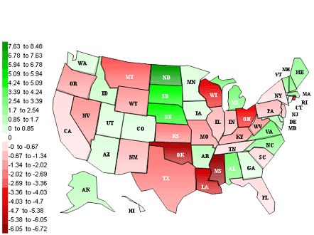
Geo Map Type: Equal Bands
This type is based on equally divided ranges.
In this example we have ten colors for positive values and ten colors for negative values.
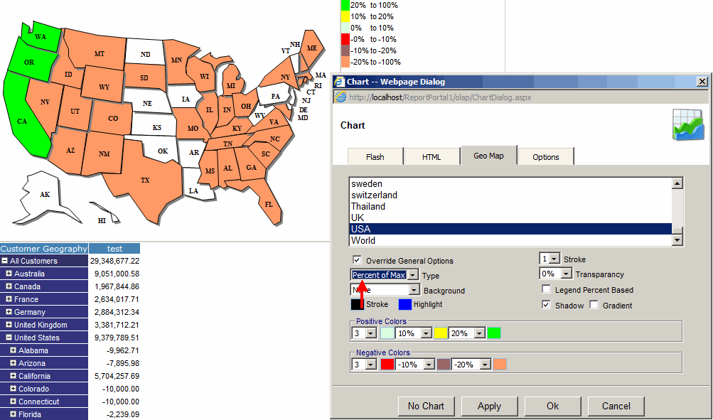
Geo Map Type: Percent of Max
This type is based on percent of a maximum value.
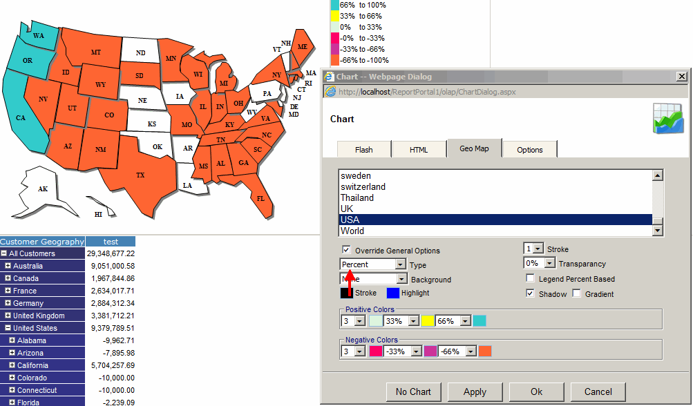
Geo Map Type: Percent
This type is based on percent of a total.
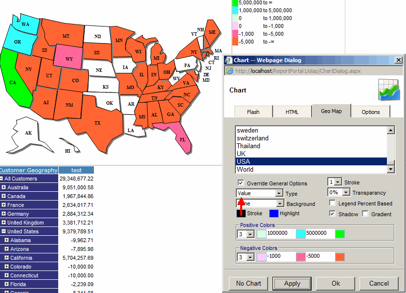
Geo Map Type: Value
This type is based on an absolute value.
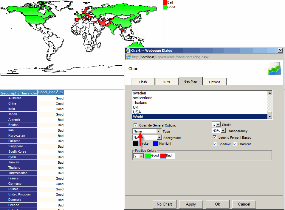
Geo Map Type: Name
This type is based on the measure text.
In this example, Good_Bad calculated measure was created with the following MDX expression:
IIF([Measures].[Sales Amount]>100000000,'Good','Bad')
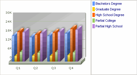
Flash Charts
Flash charts need Macromedia Flash 8 or higher
to be installed on the client PC.
If flash is not installed, the application
will help the user install it.
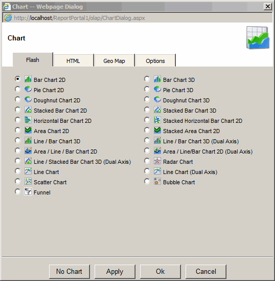
Bar Chart 2D
Bar Chart 3D
Pie Chart 2D
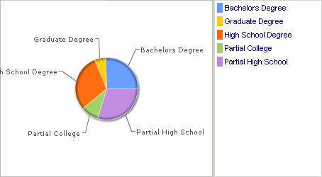
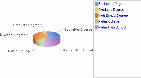
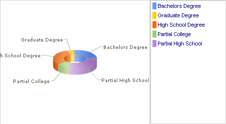
Pie Chart 3D
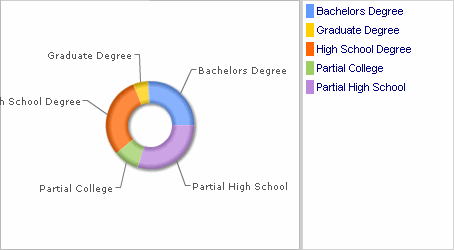
Doughnut Chart 2D
Doughnut Chart 3D
Line Chart
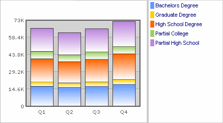
Stacked Bar Chart 2D
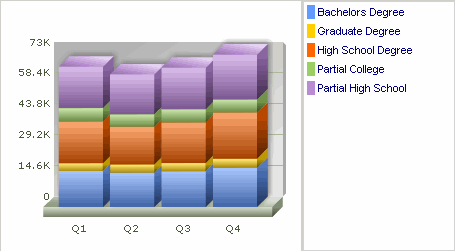
Stacked Bar Chart 3D
Horizontal Bar Chart 2D
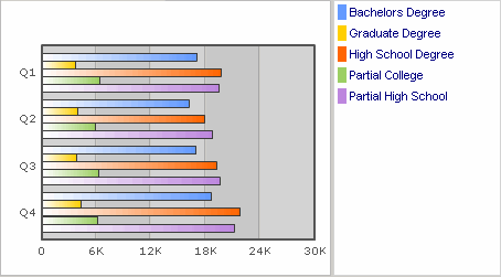
Stacked Horizontal Bar Chart 2D
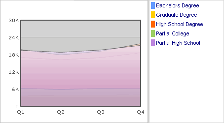
Area Chart
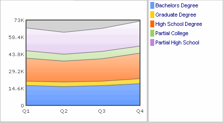
Stacked Area Chart
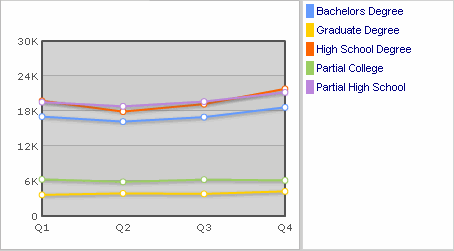
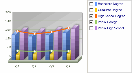
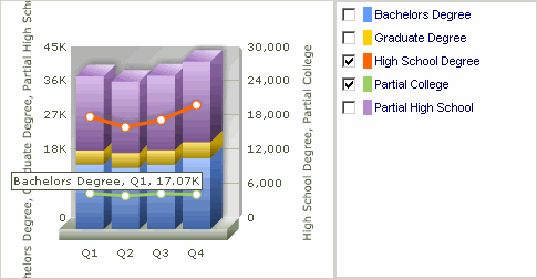
Bar/Line Chart 3D
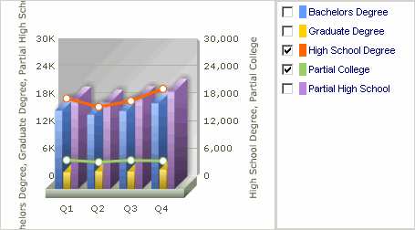
Bar/Line Chart 3D (Dual Axis)
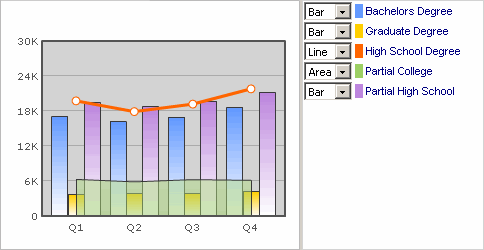
Area/Bar/Line Chart 2D
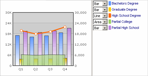
Area/Bar/Line Chart 2D (Dual Axis)
Stacked Bar/Line Chart 3D (Dual Axis)
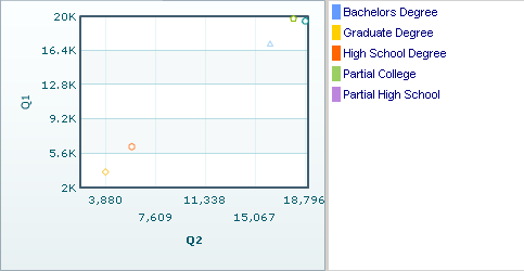
Scatter Chart
Bubble Chart
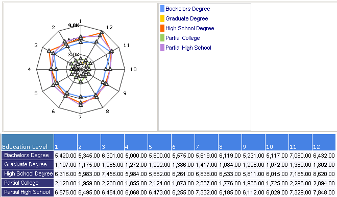
Radar Chart
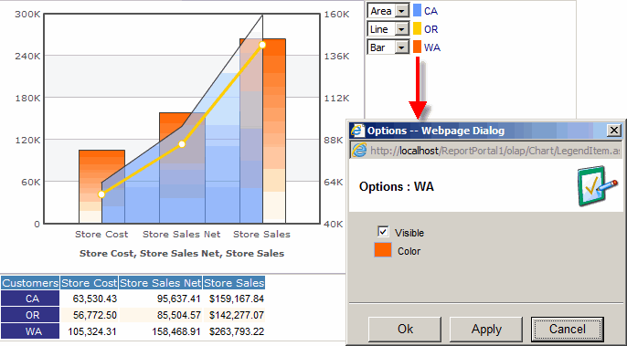
Legend
You can hide a data row or change its color. Right click on a legend item to bring up the dialog to make these changes.