Columns panel
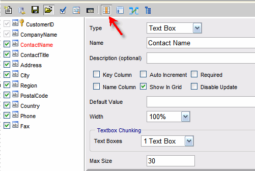
Columns panel form provides the ability to specify how each column is displayed and used.
After a column is selected on the left side, you can specify its properties on the right side.
Note that the positioning of the control on the page is done in the Layout mode.

The following types of columns are supported:
- Text Box - free text input. This type is useful for text and number data types.
When data type is numeric, only numbers can be entered.
- List - Dropdown list.
- Combo - Dropdown list with an ability to enter text into it.
- Combo Autocomplete - Dropdown list is filtered dynamically as user enters data
- DB Lookup - Lookup list from another table. This type is useful for large lists (200 records and up).
- Radio Buttons - This type is useful when there are few options very long descriptions such as in a questionnaire.
- Check Box - This type is useful for "Yes" or "No" type of column.
- Date Picker - Calendar control to pick a date for a date column.
- Text Area - Multi-line Textbox. Can be an HTML editor.
- File - Can be used to upload, download and view files in a BLOB data column.
- Password - Textbox with the ability to hide contents.
- Hidden - Control is not visible to the user. This type is helpful for using "Auto Increment" column or the default value.
- Ratings - 0-5 star rating.
- URL - URL link for a number or text column.
The field will be read-only unless "Allow edit" option is checked.
The following attributes are supported:
- Name - The label to be used next to the control.
- Description - The detailed description visible only when a user mouses over the help icon
 next to the control.
- Default Value - The value to be used for a new record.
When "Expression" is checked, the default value is treated as SQL and is executed against the database.
When "Use for Update" is checked, the default value is used for update.
The "Use for Update" option is visible for hidden type only and is useful for LastUserId and LastDateUpdated kind of columns.
Following security tokens can be used:
- ::UserId - ReportPortal User ID
- ::NtUserId - Windows User ID
- ::Email - Email
- Width - width of the control in pixels.
Supported by: Text Box, List, Text Area, Password and Combo.
- Height - height of the control in pixels.
Supported by: Text Area.
- Not Selected Label - used for columns that allow NULL to represent a NULL selection.
Supported by: List, Radio Buttons.
- Max Size - Maximum number of characters allowed.
Initially, this value defaults to the size of the database column.
Supported by: Text Box and Password.
- Textbox Mask - Format for entering data (Phone, Date, SSN , etc.)
Can be used when "Textbox Chunking" is not used.
Supported by: Text Box
- Date Format - specifies the way in witch date should be stored in the database and presented to the users.
For example, the date can be shown based on US (Month/Day/Year) format or ANSI (Year.Month.Day) format.
Supported by: Date Picker.
- Text Area Type - supported by: Text Area. Provides two options:
- Plain Text
- HTML - HTML Editor
The following binary (on/off) options are also available:
- Key Column - specifies column(s) that uniquely identify each record.
At least one column has to use this option before the form can be saved.
- Auto Increment - specifies columns that will be auto generated by the database engine.
- Required - specifies the columns that need to be filled in before the form can be submitted for insert or update.
Every required control will have a red asterisk (*) next to it.
- Name Column - specifies column(s) to be used in the navigation tree.
At least one column has to use this option before the form can be saved.
- Show In Grid - shows the column in data grid.
- Disable Update - disables this column for updating.
- Max plus one - gets the next maximum value during the insert. Available only when "Auto Increment" option is unchecked.
- Apply Date Mask - applies to date columns.
- Update in Grid - will allow the column to be updated in the data grid.
Make sure that "Allow Grid Updating" report option is checkd.
The columns are initially set to their default types based on their data types.
- Date type of column is set to Date Picker column type.
- Blob (image) type is set to File column type.
- Text data type is set to Text Area column type.
- Boolean (bit) data type is set to Check Box column type.
- Auto Increment column is set to Hidden column type.
- Every other column is set to Text Box column type.

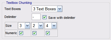
Textbox Chunking
Some text column, such as phone number, can be broken into many text boxes.
The delimiter specifies how that the data is separated.
For example, if the delimiter is "-" then a phone number will be stored into the database as 123-456-7890.
"Save with delimiter" option lets the data to be stored in 123-456-7890 format as opposed to 1234567890 format.


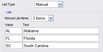
List Type
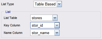
List, Combo, DB Lookup and Radio Buttons support the following type of lists:
- Table Based - provides a quick way of creating a list based on a table with few rows.

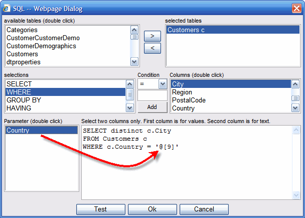
- SQL Based - provides a way of creating a list that can be filtered and sorted based on the SQL.
The (Build) link opens an SQL builder.

SQL based list provides a way to create a list what would depend on another list.
For example, Cities list can depend on the Country list selection.
To use this feature, simply use a parameter in the WHERE clause of the SQL statement.
A parameter has @[column number] format and can be inserted into the WHERE clause by selecting a cursor position
and double clicking an item in the parameter list.
Note that the parameter list includes only columns of the following type: List, Combo, Combo Autocomplete and DB Lookup.

- Manual - a way of creating a list not based on database data.


Check Box
Check Box is useful for "Yes" or "No" type of column.

- Yes Value - Value to be stored in the database when the check box is checked
- No Value - Value to be stored in the database when the check box is unchecked
